Living a 1.5 degree lifestyle is hard
But I have it easy compared to most North Americans, and perhaps am fooling myself.
As noted earlier, I have committed to trying to live a 1.5° lifestyle, which means limiting my annual carbon footprint to the equivalent of 2.5 metric tonnes of carbon dioxide emissions, the maximum average emissions per capita based on IPCC research. That works out to 6.85 kilograms per day.
There has been radio silence about my 1.5 degree lifestyle experiment for about a month; that’s because figuring out how to do this is really hard. The data are all over the map; I had said that I was going to rely on Mike Berners-Lee’s book ‘How Bad Are the Bananas?’ and follow the example set by Rosalind Readhead and document every single thing I eat or do; she counts every tweet and every radish. The trouble is, you can get really bogged down in the minutia and, if you are trying to create a spreadsheet, it gets really ridiculous.
But as they noted in the 1.5-Degree Lifestyles: Targets and options for reducing lifestyle carbon footprints study, there are ‘hot spots’:
Focusing efforts to change lifestyles in relation to these areas would yield the most benefits: meat and dairy consumption, fossil-fuel based energy, car use and air travel. The three domains these footprints occur in – nutrition, housing, and mobility – tend to have the largest impact (approximately 75%) on total lifestyle carbon footprints.
I can’t do much more than I have about the housing impact than I have already (namely cutting the space that I occupy in half), so it is nutrition and mobility that will have the biggest effect.
Tracking diet was the hardest thing when I started, listing every single food, trying to figure out everything in it, getting out the digital scale to weigh it.
But then I had a closer look at the greenhouse gas emissions per 1000 kilocalories of food chart prepared by Our World in Data, a much more sensible way to look at it than emissions per kilogram of food, since caloric density can vary so widely. And you can see that there is a huge break between bananas and brassicas (Brussels sprouts and family) and eggs, and then between eggs and meat. I decided that I should just really be concerned about tracking the big numbers, the Brussels sprouts and up. This follows the method used by Jean-Christophe Mortreux of Montreal’s Emissions Reductions Now, who has been tracking his carbon footprint with an elaborate spreadsheet, but just has an allowance for a vegetarian meal. Since so many of those numbers below the bananas are so close, I thought this was a good idea, and would only track the big items independently. This made it far easier to build out the spreadsheet.
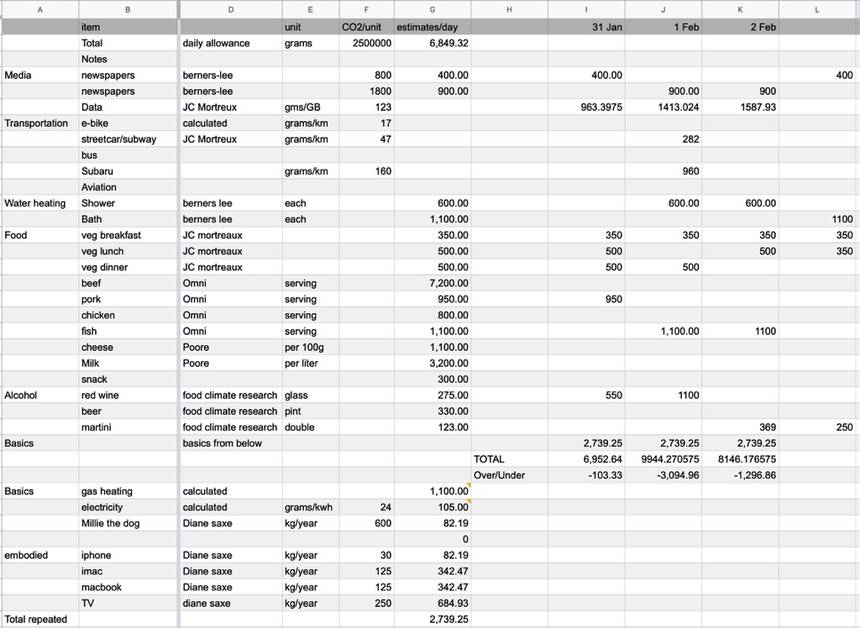
There are certain items that I treat as fixed; I took 60 percent of our gas bill that covers heating and separated out hot water, since I know from Mike Berners-Lee the impact of a shower or a bath. With every bulb in our house being an LED and our electrical power 95 percent carbon free, I don’t bother tracking every bit of electrical use and just use a fixed amount. In the first iteration of the spreadsheet I included the estimated embodied carbon of my electronics, but that pushed the fixed items up so high that hitting the target was almost impossible, and why just electronics? Why not my washer and dryer and other appliances? I decided that including all the upfront or embodied carbon was just too hard to calculate and too much to worry about.
One thing that I did want to track carefully is my Internet use. Between working and researching, I am on my computer at least 12 hours per day. Here again, the numbers are all over the map; some studies say a gigabyte of data takes 7 kWh; that’s ridiculous. Another study I found says 0.06 kWh/GB, or 60 Wh, and I have no idea what value to use to convert that to grams of carbon. Jean-Christophe Mortreux uses 123 grams per gigabyte, which I have used in this spreadsheet for now and it is the biggest load on the spreadsheet most days; it is lower on Tuesdays because I am out teaching half the day.
 Spreadsheet at time of writing this post/ Lloyd Alter/CC BY 2.0
A couple of things are immediately obvious: The only reason I can even get close to the target is that I work from home and live in a part of town where I can bike everywhere, and it hasn’t snowed enough to close down the bike lanes. Thanks to the previous Liberal government in Ontario which closed all the coal fired power plants, our electricity supply is 95 percent carbon free. I have not had to make serious lifestyle changes other than giving up the red meat, which we only ate occasionally anyway. I also don’t get out much; one evening out with a 4-mile shared taxi ride home on Feb 1 blew a giant hole in my budget. And next week I have to fly to New York to meet the Dotdash people who now own TreeHugger; that may well blow the budget for the whole project.
Is this a realistic option for most people? The more I get into it, the less convinced I am. I worry that I am suffering from what Jarrett Walker calls “elite projection“.
Elite projection is the belief, among relatively fortunate and influential people, that what those people find convenient or attractive is good for the society as a whole.
I happen to have chosen years ago to live in a streetcar suburb close enough to downtown that I can bike everywhere. I work from a home that I could afford to duplex and downsize in. I can walk to four different big grocery stores. I bought a nice e-bike. My wife used to write about food and can whip up wonderful vegetarian meals.
I am coming to realize that for others to be able to do this, we really need societal change; we need good, efficient housing built at densities that can support transit, that are walkable and bikeable so that people do not have to drive. Then it really becomes a matter of minor dietary changes and choices about travel. For the 73 percent of North Americans who live in the suburbs and are pretty much forced to drive, doing this would be almost impossible.
Is it still worth doing? I think so, even if just as an example for my students, and I am going to keep it up for the term at least. Stay tuned for updates, and a downloadable spreadsheet that readers can play with.
But I have it easy compared to most North Americans, and perhaps am fooling myself.
Please enable JavaScript to view the comments.